Case Study: User-friendly website for a healthcare leader

Helen Hayes Hospital is a leader in the field of physical rehabilitation and research since its founding in 1900 and is widely recognized as one of the nation’s premier physical rehabilitation hospitals. They provide innovative and compassionate care to individuals following catastrophic injuries and disabling surgeries or illnesses, enabling them to resume their highest level of independence and achieve active, fulfilling lives. They came to BBG&G looking for a true website partner, someone to help them redesign and rebuild their site, implement best SEO and ADA Compliance practices, and conduct ongoing website maintenance.
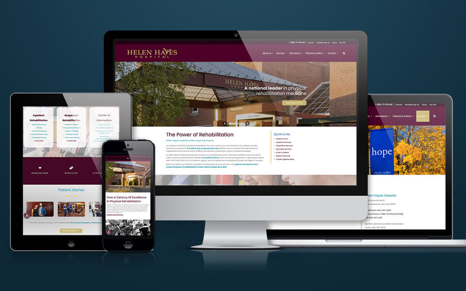
Our team of experts developed an approach to give visitors a full sense of the hope and recovery they can expect to find at Helen Hayes Hospital.
Intuitive Navigation
We based our web development methodology on the UX (User Experience) model, creating a website around the kind of experience we wanted users to have. The website navigation before the redesign was cumbersome and confusing to users, so this was our first deliverable for Helen Hayes. We completely reorganized their web structure and created intuitive navigation for better UX.
Functionality
It is important for websites to be as fully engaging and interactive as possible. Besides strong photos, descriptive content, video integration, and intuitive navigation, we wanted to further expedite the viewer’s exploration of Helen Hayes Hospital’s services and stories. So, we planned to do the following:
- Incorporate embedded video
- Inform, educate, attract, and engage prospective inpatient and outpatient clients
- Provide a responsive user-friendly site experience
- Provide for ADA Compliance according to WCAG 2.0 guidelines
- Secure HIPAA compliant hosting
In addition, we outlined new approaches to the layout of the website:
- Incorporate a new theme that will make the website liquid (fully responsive)
- Incorporate full-width imagery and headers (for sections and pages)
- Throughout the website, add sections (streamlining pages)
- Replace current text embedded over images in slideshows (counterproductive for SEO and ADA) with text that exists on its own layer above slideshow images
- Change layout into sections – add headers with pictures in between sections
- Break up content with more visual icons and/or bullets
- Update fonts and colors to convey a warmer, more friendly, but still up-to-date feel
Search Engine Optimization (SEO)
We utilized current industry standard best practices to redesign the Helen Hayes Hospital website to be user, browser, and search engine friendly. Based on the client’s goals and our initial intake, we recommended:
- Responsive design
- Properly constructed tags, content, and navigation
- Text-based links for navigation
- XML site map
- Monitored backlinks to eliminate penalty-prone links
- Requested search engine recrawl
- Optimized content for identified search trends
- Keyword consistency to help focus page content around particular keywords to rank for, using the title, meta, and header tags.
- Friendly URLs that are as readable as possible by reducing length, file names, code strings, and special characters.
- Image alt attributes & optimization
Results
BBG&G designed a sitemap that was user-friendly with quick links to each sub-service and grouped them by category. Information architecture was streamlined to ensure that users would not have to click through several pages to get the information they need. In addition to improving the site architecture, BBG&G built a responsive mobile-friendly website that followed ADA Compliance according to WCAG 2.0 guidelines and secure HIPAA compliant hosting. The new website launch in July 2021 was successful and we continue to maintain the Helen Hayes website including SEO best practices.
By Kayla, Account Manager & Strategist | March 22, 2022


